“I have a way of filming things and staging them and designing sets. There were times when I thought I should change my approach, but in fact, this is what I like to do. It’s sort of like my handwriting as a movie director. And somewhere along the way, I think I’ve made the decision: I’m going to write in my own handwriting. That’s just sort of my way,” Wes Anderson.
Notable directors such as Steven Spielberg and Christopher Nolan have their own specialized little recipes that take their visions towards the successful cinema viewers know and love. These factors that each respective director has perfected can be labeled as their hallmarks.
These moments and tricks give directors their visionary title. One director has had such an impact via his hallmarks to completely revive a whole aesthetic. One with shots of symmetry and pastels, edited and mixed sound with enough themes to make a cinephile drool. Wes Anderson has completely reshaped the directing game.
While dissecting Wes Anderson’s recipes for aesthetics, one must go on a path of their very own to watch these films. Understanding the films themselves, while initially not essential for understanding the recipe, provides a new insight into what Anderson is attempting to portray under all the color palettes and eagle-eye shots.
Many of his films tend to go off the rails of “conventional” creating a somewhat complex story for one to follow. Most viewers top off their watching of the movie with a 10 minute youtube video in which it explains the ending, a practice I personally am all too familiar with.
Wes Anderson movies often catch flack for this idea of “style over substance”, and not to stray off the topic of his recipes for creating such a style, it’s important to look at things at its full completion – not just a couple of frames.
While the discussion of new-wave cinema (especially with new-wave indie, prioritizing style and cinematography over story) is ongoing and as a topic spans further than Anderson. However, it is important to note that Anderson is perhaps the most notable figure that most critics use as an example of the “style over substance” dilemma.
In defense of the many critiques, Strike Magazine argues that “The Wes Anderson world is found in the details of the style itself. Anderson often adheres to his own brand of formalism—an approach to filmmaking in which the techniques (lighting, framing, editing, etc.) are used to create meaning in the film—rather than the more commonplace approach of realism, where the camera records exactly as the eye would naturally see, and meaning is derived from what occurs.”
With the acknowledgement that Anderson’s recipe isn’t just for visual pleasure, now it can be appreciated by the masterful cinematography, on top of the material Anderson incorporates into the film.
The emotional recipes of Anderson’s plot often goes into the themes of familial dysfunction, nostalgia of the past paired with ones searching for belonging. All together with the juxtaposition of whimsicality and melancholy.
The more technical side of things dives into a particular set of camera angles and color schemes that really give his work something special.
The use of tableau shots within his work has become a staple. A tableau vivant, divided from the French term tableaux vivants can be described in many ways, “A straight Google search of the word’s meaning brings up multiple explanations. These range from simply just “a picture”, to descriptors such as “vivid” and “graphic”. A variation of the theater phrase “tableau vivant” describes a “living picture”. This “living picture” when translated from french has made its mark
“Before the age of color reproduction of images, the tableau was sometimes used to recreate artworks on stage, based on an etching or sketch of a painting. This could be done as an amateur venture in a drawing room, or as a more professionally produced series of tableaux presented on a theater stage, one following another, usually to tell a story without requiring all the usual trappings and production of a full theater performance.”
Being mostly used in theater before cinema, it provides an expert way of blocking and showing characters in a theatrical way, more moving than a straight shot.
According to The Beat, “The arrangement of people and objects within the confines of your cinematic frame” – as argued in the article, isn’t that just every cinematic shot? What make the tablaeu shot one of much renounced cinematic power, you must incorporate other factors, which, mush alike to Anderson’s own recipe, calls upon a multitude of other cinematic maneuvers, “Elements of composition, along with an obsession for every possible visual detail, are important for developing a striking tableau style.”
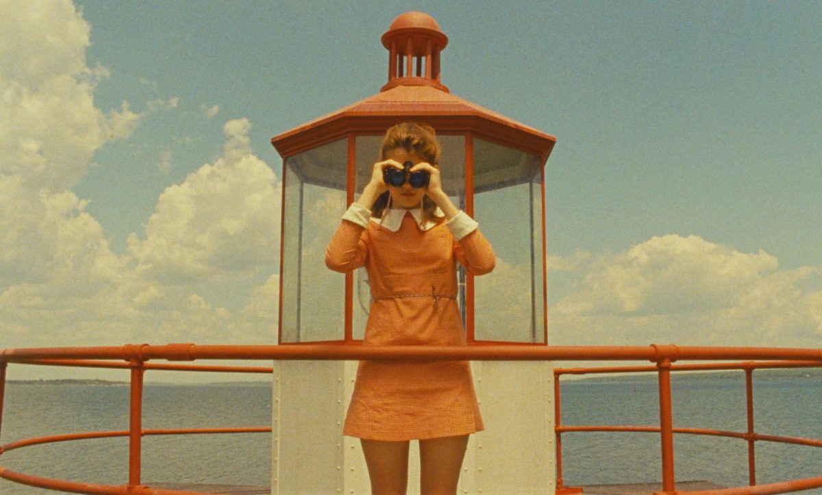
Composition, one of the main features of these masterful tableau shots strewn in Anderson’s art, can be easily noticed and adored. Anderson’s perhaps most unmistakable cinematic manuver is the usage of symmetrical frames.
As shown in the video down below, Andersons most notable scenes bend to the will of the straight line in the direct middle. Slash films argues that the symmetry in his work is a comment on realism versus formalism filmmaking.
Vimeo link: Wes Anderson // Centered on Vimeo
“Anderson’s love of symmetry, like his other favorite stylistic choices, reflects his preference for formalism over realism in the movies he directs. Now, in the broadest sense, formalism in cinema could be defined as a style of filmmaking that reflects a director’s subjective perspective on and understanding of the world — where realism, as the term implies, is an approach to filmmaking that aspires to emulate the real world as objectively as possible.” According to Yahoo News UK
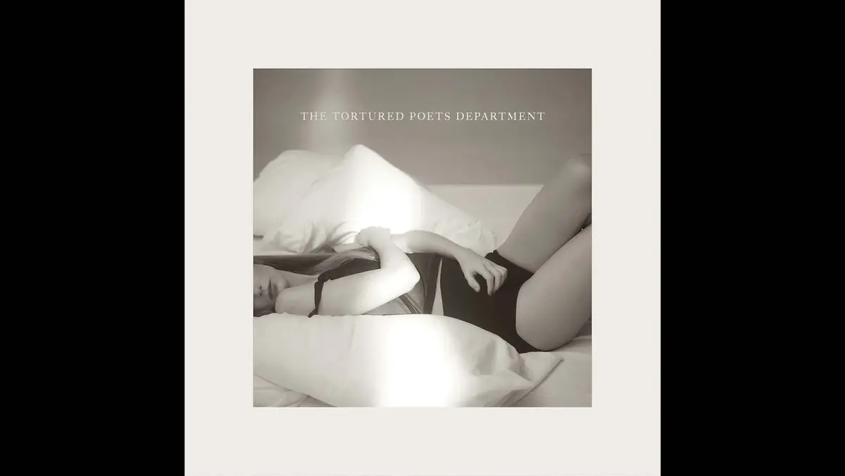
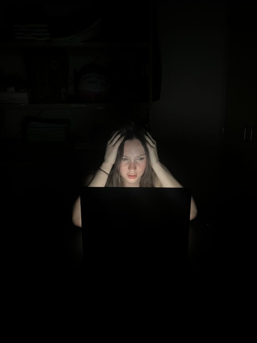
Along with the symmetrical aspects, in order to not just make the shot subconsciously pleasing, the usage of harmonious color pallets have essentially given the framework to Anderson’s style. When looking into last springs “filming myself like I’m in a Wes Anderson movie” trend on TikTok, we saw surface level symmetry, but most notably, color pallets easy on the eyes. Through filters, outfit choices, or lighting – the colors in which Anderson surrounds his characters have certainly left their mark.
The usage of color therapy within Anderson’s films comes as a pretty easily analyzed motif.
According to Yahoo News UK, “Wes Anderson uses color uniquely in his films, manipulating color in his work to portray his different ideas. Often using brighter colors when referring to a darker subject. He uses different hues, brightness and saturation in extreme ways, often as an ode to childhood, or more specifically, childhood trauma.”
Not only does Anderson portray these themes in his character writing and set blocking, he will occasionally advance an insight towards a repetitive character by assigning them their own color.
An example of this is within Andersons 2014 film, Grand Budapest Hotel, “Anderson also commonly associates color to characters, like Monsieur Gustave being assigned purple in the Grand Budapest Hotel. Red is also assigned to many of his characters, like the red tracksuits worn by Chaz and his sons in The Royal Tenenbaums. The red is a display of his anger built up from deep rooted trauma from his parents. His children also wear these tracksuits as a reflection of the rage passing on to them. However, at the end of the film their characters wear back as a display of acceptance. This is a clear example of the Andersons use of color to revolve around emotion.” According to Yahoo News Uk.
Anderson, while having criticism on his filmmaking, still holds notability and recognition as one of the most influential American modern day directors. Everything done within his creative process has its own respective meaning, as well as its own finished outcome. The pieces of the puzzle that are storylines and dialogue are sewn together by the tone and motifs regularly displayed in his films, thus creating the Wes Anderson recipe.


